



A signup form is a small thing to build and a surprisingly big thing to ask someone to complete.
As a founder, you know what sits on the other side. You’ve spent weeks making it work. You can picture the finished report, the organized workspace, the task that used to take an afternoon and now takes a few minutes.
Your visitor has a headline, a screenshot, and whatever expectations they brought with them.
That gap deserves more attention than it usually gets.
When someone arrives at an unfamiliar product, they’re deciding whether it deserves a place in their day. Creating an account means spending time, handing over information, and opening the door to another product they may need to learn.
There should be something concrete helping them make that decision.
Let the product make part of the case
Consider a tool that reviews websites and suggests improvements.
The landing page might promise clearer messaging, fewer usability problems, and better conversion. Those are appealing outcomes. They also leave plenty of room for interpretation.
A sample review gives the visitor something to examine. They can see which problems the tool notices, how specific the recommendations are, and whether the advice seems useful.
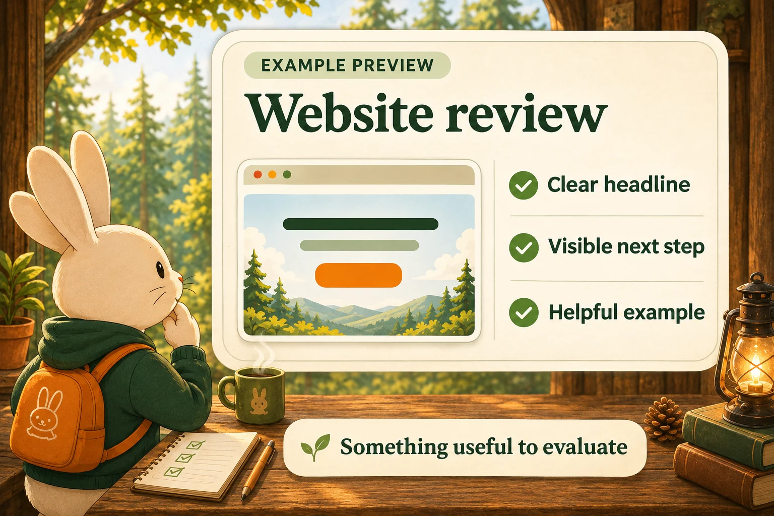
They might discover that the report catches exactly the kind of issue they’ve been struggling with. They might decide it’s too basic for their needs. Both responses give them a better basis for choosing what to do next.
For an early-stage founder, that clarity matters. You want people arriving in your product with expectations it can meet.
The useful question is: What could someone experience that would help them understand the benefit?
A proposal tool could let them explore a finished proposal. A planning app could open with a realistic example project. A design tool could let them edit a template and see their changes immediately.
The experience can be small. It needs to reveal something meaningful.
Show the part people came for
It’s tempting to turn a preview into a tour of everything you’ve built.
You know how much work went into the dashboard. You’re proud of the customization options. There’s a clever integration you’d like people to notice.
A visitor may simply want to know whether the product can help them write a better proposal.
Start there.
Show the finished work. Let them examine the result. Give them enough context to imagine using it in their own situation.
A realistic example often does more explanatory work than a polished screenshot filled with placeholder text. Someone should be able to recognize a problem, follow what the product does, and judge whether the outcome would help.
For products where quality is difficult to assess, include the detail that makes assessment possible. A research tool might show its sources. A calculator might explain its assumptions. An audit might connect each recommendation to the issue that prompted it.
You’re giving the visitor something they can evaluate for themselves.
Make signup a useful next step
Once someone has experienced value, creating an account can have an obvious purpose.
They may want to save the report they just generated, return to the project they started, or share something with a colleague.
“Create an account to save your report” gives the request context. The visitor understands what they gain by continuing.
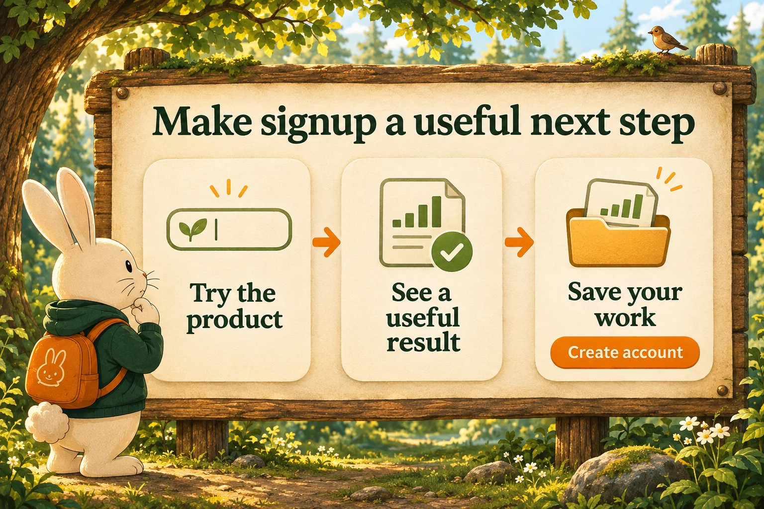
That promise needs to hold up. If someone spends ten minutes entering information and only then discovers that seeing the result requires payment, the experience can feel like a trap.
Explain the limits early. Tell people what they can try, what they’ll receive, and what requires an account or a paid plan. Their time is part of the exchange.
You also don’t need to build an elaborate demo to explore this idea. A sample deliverable or a short walkthrough of one useful task may be enough to start.
Show it to a few people who match your intended audience. Listen to how they describe the product afterward. Notice what they understand, what interests them, and where you still have to step in with an explanation.
Then follow what happens beyond the preview. Do people continue? Do they reach a useful result after signing up? Does the experience match what they expected?
A preview earns its place when it helps the right people make a more informed decision.
Your visitor arrives with limited time and an incomplete picture of what you’ve built. Give them something useful to work with.
The signup form becomes a much easier ask when they already have a reason to want what comes next.
