Most visitors do not give your landing page a fair read at first. They give it a glance.
They arrive with no backstory, no context, and no idea how much thought you put into the product. They scan the headline. They look for something familiar. They try to figure out what kind of thing they are looking at. Then they make a tiny decision: do I understand this enough to keep going?
That decision happens fast.
Your landing page does not need to explain everything in five seconds. It does not need to cover every feature, use case, future plan, or reason your product exists. It just needs to make someone curious enough to stay.
That is the real test.
A lot of founders think they need more traffic. Sometimes they do. But sometimes the page is already getting chances, and the first impression is not clear enough to hold them. More visitors will not make a confusing page easier to understand. Traffic can amplify interest, but it can also amplify confusion.
The first five seconds are not about perfection. They are about orientation.
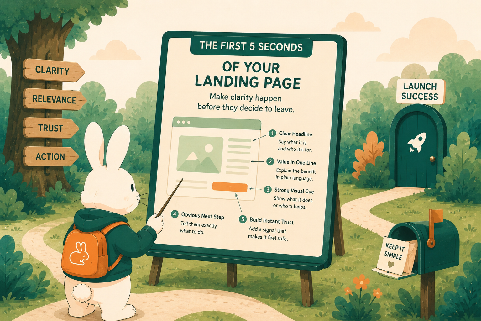
The questions your page needs to answer
When someone lands on your page, they are quietly asking four things: what is this, who is it for, what does it help me do, and what should I do next?
That sounds simple. But a surprising number of landing pages hide those answers. The headline tries to be clever instead of clear. The subheading describes the category instead of the outcome. The CTA is vague. The product screenshot is missing, tiny, or hard to read. The page leads with features before the visitor knows why those features matter.
Your job is to help someone answer "Is this for me?" without making them assemble the meaning piece by piece.
The first section of your page should make the product feel legible. A visitor should be able to say, in plain language:
"This helps this kind of person do this kind of thing."
If they can do that, they are much more likely to scroll, click, try, or share.
Where landing pages usually lose people
Most confusing landing pages are not bad because the product is bad. They are confusing because the founder is too close to the idea.
When you have been building something, every phrase carries extra meaning. A vague headline feels obvious because you know what it points to. A feature list feels compelling because you remember the problem that made each feature necessary. A clever sentence feels delightful because you already understand the product underneath it.
A new visitor does not have that context. They only have what the page gives them.
This is why phrases like "AI-powered platform," "smarter workflow," "all-in-one hub," or "the easiest way to manage everything" often fall flat. They sound polished, but they do not help someone understand the specific job your product does. The words float above the product instead of opening the door to it.
Another common problem is starting too broad. A page might say it helps teams "save time" or "work better," but almost every product wants to claim that. The more general the promise, the harder the visitor has to work to understand why this product exists.
Specificity is kinder. It gives people somewhere to stand.
This is part of why we built Buildhop differently. Instead of ranking products by upvotes, we track behavioral signals — how long someone actually spends with a product, whether they follow through, whether engagement builds over time. A product that holds attention is saying something a upvote count cannot. The same logic applies to your landing page. If someone arrives and leaves in two seconds, that is a signal. If they scroll, click, and come back, that is a different one.
A simple 5-second test
The easiest way to test your landing page is to show it to someone who does not already know what you built. Let them look at the top of the page for a few seconds, then ask them what they think the product does.
Do not explain first. Do not defend the wording. Do not give them the backstory. Just listen.
If they can explain the product back to you in roughly the way you intended, your first impression is probably working. If they describe something too broad, too vague, or completely different from what you built, the page needs to be clearer.
This test is useful because it removes the founder's internal context from the equation. You already know what you meant. The question is whether the page can carry that meaning on its own.
You can also ask more specific questions:
"Who do you think this is for?"
"What would you click next?"
"What part feels unclear?"
"What would make you trust this enough to try it?"
These questions are small, but they reveal the exact moment where the page stops making sense.
How to make the first five seconds stronger
Start with the headline. A good headline does not need to be fancy. It needs to create immediate understanding. The best version usually names the person, the problem, the outcome, or the product's main job.
Then use the subheading to add context. If the headline gives the shape of the idea, the subheading should make it easier to understand why the product matters. This is where you explain the use case, the benefit, or the difference between your product and the usual alternative.
Your CTA should be obvious. A visitor should not have to hunt for the next step or decode what the button means. Different CTAs create different expectations:
"Get started" — low friction, implies immediate access
"Try the demo" — signals there is something to see before committing
"Submit your product" — action-specific, tells you exactly what happens next
"Join the waitlist" — honest about where things stand
Choose the one that honestly matches what happens next.
A product visual helps too. A screenshot, short demo, example card, or sample output makes the page feel real. People trust what they can picture.
And if the page still feels hard to explain, try removing language before adding more. Founders often pile on copy when something is unclear, but sometimes the fix is sharper copy, not more copy. One clear sentence can do more than a whole paragraph of mist.
A stranger's first reaction is useful
The hardest part of improving a landing page is that you cannot see it fresh anymore.
You know what the product does. You know why the headline makes sense. You know what the screenshot is showing. You know what happens after someone clicks the button. A new visitor does not know any of that.
That is why a stranger's first reaction is so useful. They are not judging the product from inside the founder's head. They are reacting to what the page actually communicates.
If they pause in the wrong place, that tells you something. If they misunderstand the product, that tells you something. If they cannot tell who it is for, that tells you something. If they understand the idea but do not know what to click next, that tells you something too.
This kind of feedback can feel small. It is not.
Before you chase more traffic
Distribution matters. Getting in front of more people matters. But your landing page is part of distribution too. It is the place where attention either turns into understanding or quietly slips away.
Before you send more people to your product, make sure the first few seconds are doing their job. Make sure a stranger can tell what you built. Make sure the page gives people enough context to care. Make sure the next step is easy to find.
You do not need a perfect landing page to launch. But you do need enough clarity for someone to arrive, understand the point, and decide whether they want to keep going.
That is what the first five seconds are for.
Not to explain everything.
Just to open the door.