Loading BuildHop
Loading BuildHop

Founder Feed
Self-promotion welcome. Share your product, post updates, and connect with other founders.

Nigel Lane has responded to some feedback for PRISM Classroom
Not a teacher, but I imagine there are very few products like this in the education sector. UI looks fun and engaging, and I imagine that the little illustrations are animated too which makes the whole thing feel more alive. I like it!
Thank you! We don't have animated illustrations on the site... keeping it simple and clean. Within the app, however, we have integrated Klipy so users can add GIFs to their lessons for a little fun and engagement!

Nowshad Hossain has responded to some feedback for Encrypted Clipboard Manager
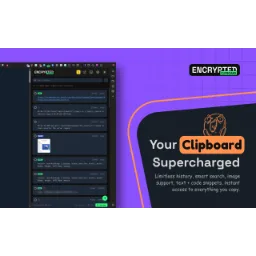
gotta love on the clipboard apps.. but there are starting to be a fair number of these. Also where did you come up with those hours per year saved metrics?
that's true, but not all of them are end-to-end encrypted with zero-knowledge architecture, and not all of them have the same lightweight and faster UI that gives no lagging and the "time saved" metrics are based on different other websites data that I found through AI research
Nowshad Hossain has responded to some feedback for Encrypted Clipboard Manager
Now this is pretty rad. No notes, just wanted to give you some props.
you mean, you want a "Note" feature on clipboard extension?
Nowshad Hossain has responded to some feedback for Encrypted Clipboard Manager
on hero video is conflicting with the header, which is annoying
thanks for your feedback, I'm working on it :)

Alex Marin has responded to some feedback for One Design
What would make this instantly more powerful is if this wasn’t a million disjointed tools and instead of workspace of all tools, then as you add tools and scale the tools have somewhere to live, this would also allow a user to utilize multiple tools for the same artifact. Most importantly a centralized workspace could allow you to make an MCP so that agents could use every tool or multiple tools on one piece of work. A million different tools is super mid!
 One Design
What’s actually mid is telling someone their Miata is mid because it can’t haul sheep. This is still evolving, but it’s already what I wanted: tools that work alone or together, replacing a pile of mediocre bookmarks. Sounds like you’ve got a big idea. Build it and share it with us.

@guyalexhamilton has responded to some feedback for PlatPost
At first I honestly wanted to hate the green but it quickly grew on me, I think it’s fun and kind unique. The one thing I’d say is you have some underlying hard edges around the rounded corners of every container which looks kinda broken, I also noticed that the proof slider at the top is t edge to edge on mobile and the cards appear to cut off with a hard edge. Nit picky things but these little frontend issues lower trust in the age of slop. Great product though! 🙌
 PlatPost
wow thats super valuable feedback oh my word! thank you!! i will implement fixes right now, and youre spot on, those little issues add up and give a lasting impression, i should have had those fixed, sorry about that
@guyalexhamilton has responded to some feedback for PlatPost
nice branding, well done, the landing page is informative as well
PlatPostthank you very much! constantly working to make it better each day, i really appreciate the feedback
Alex Marin has responded to some feedback for One Design
The images can be color. Because rest of design is very clean and good UX but color images would make it feel more engaging
One DesignThank you. I've got a bit of contradicting feedback on this one as another user suggested I get rid of them as it makes navigation more difficult. I believe he was only partially right. The images reinforce the brand and make it more engaging, but my main focus was to implement them consistently without distracting from the main focus, which is to explore and find the tools available. There is a pop of brand colour on hover! ;) I do appreciate the feedback, thank you!

I honestly love the motif! I wouldn’t go the color route, it feels immersive and I love the green you chose. What I would consider though is when I switch to light mode it also switches the image to light versions of the same images, that would be awesome.
Thanks Jacob, glad you have the same opinion. Yes very good point. I did consider it, it does go pretty contrasty on light and they suddenly pop too much. It will require quite a bit of work but I'm down to explore and see how that looks. Forget the 15+ other tools and features I got on the pipeline! 🤣

@isaachinman has responded to some feedback for Marco
Not in love with the colors here. Kind of too dark for a positive site that helps with email. Good idea, I can bet that person that said they were for sure signing up is going to be a customer service nightmare. Anyone that comes out and says that at 3am is eating food after a night of drinking and will totally forget this site. Tire kickers is what you get with free.
MarcoIt's not a "site", it's a mobile and desktop app. There's a light mode if you prefer.

Emmanuel Bankole has responded to some feedback for Lasso
cool idea, needs a demonstration to see how it works tbh. And tier comparison is hard to read- probably failing accessiblity standarts, you may need to check that one
LassoAwesome feedback, working towards thr demo and a tutorial. We will look through and review the tier comparison and fix legibility, really appreciate the feedback Did you sign up for early access?

@joffreyio has responded to some feedback for MakerProfit
You know that most people just like posting the big number. MRR and ARR. Never the reality. Good idea.
MakerProfitnobody posts the stripe fees, the tools, the ads, the hours. makerprofit is the "after costs" version. thanks!

@joffreyio has responded to some feedback for ProofBench
while the idea is unique nd i like the fake door test, there is no real unique value proposition, users can just deploy to some other website and add a buy button that doesn't do anything. I don't think it's death for the idea but rather u could look into providing some UVP to ur product
ProofBenchfair point, the page alone is easy to fake. proofbench is for indie hackers with too many ideas: one fake door per idea in minutes, compared on the same signals, with benchmarks so you know if 3% is actually good. built it because i'm that guy, i've shipped way too much stuff nobody wanted.

@DrewWakefield5 has responded to some feedback for Birth Year Battle
It’s cool but who cares? What would keep someone coming back? What artifact can be created to get people to share this on X? Not much is shown on the homepage functionality wise to peak curiosity. What’s the viral contagion point, can I rally my friends somehow to vote for my year?
Appreciate you think it's cool. This is the first Season so these are things that are being worked out and developed. I think the landing page explains the concept and the ability to recruit friends or rival years. There are recruit and share features once signed up inside the app. Each year gets a captain to lead the change too. You don't vote for a year you join a year and get daily power to attack and eliminate other years. I will look into adding screenshots of the app to avoid confusion
Alex Marin has responded to some feedback for One Design
Looks great, so many good tools, especially the Logo Package one 😃
One DesignThank you, glad you find it useful! 🔥
Emmanuel Bankole has responded to some feedback for Lasso
Thats cool and the sample video is also great!!!
LassoThanks a lot, we're also looking for early testers, giving out the full plan for free, we need feedbacks!
What do you think will make lasso stand out from other vibecoding tool you've tried?
Thats cool and the sample video is also great!!!
LassoReplying is worth 50 points · 100 with Spotlight
Hop Product
Michiel has responded to some feedback for CheapTravelDestination
good one not sure how you are gonna monetize it though
Thanks! Not looking to monetize for now :) Just offering a service I use myself almost daily!
Emmanuel Bankole has responded to some feedback for Lasso
Awesome looking homepage! The product seems very useful and the value proposition is very clear. What is deterministic and context based and what is purely offloaded to an agent?
LassoThanks! Lasso handles the deterministic/contextual part, while the actual code transformation is agentic. The deterministic layer is the visual selection → source mapping → context assembly. Lasso figures out what component/file the user is pointing at, filters out irrelevant DOM elements, gathers the relevant source/imports and screenshot, and passes that focused context to the coding agent. The agent then takes that context + the user's instruction and generates the code diff

Kamba has responded to some feedback for Telosieve
Agreed with the feedback above - you can write your own copies - there's a vicious cycle in the copy that makes it very hard to read, good luck though
TelosieveThank you for your feedback, appreciate it. I made some updates!

Kamba has responded to some feedback for PermeantOS
never needed one, hope I'll not need it ever. Good luck
PermeantOSThank you for the good wishes, much appreciated.

Todd Embleton has responded to some feedback for Camprtron
I looked at this website months ago and i'm pretty blown away by how much nicer it looks today. The only thing really driving me crazy right now is the map style itself and the hero background image, the hero background image is way too busy.
 Camprtron
I think this is the fromt he same as the previous feedback - happy to discuss what you mean, DM me on X @Inglehoff
Todd Embleton has responded to some feedback for Camprtron
The map style itself is super heavy, maybe consider pulling in your brand colors and styling the map itself to better fit your brand style. You could also just use mapbox or similar free mapping libraries to style your map.
CamprtronNot super sure I know what you mean by heavy and not fitting my brand style. all the icons are custom for Camprtron, and the colors match pretty close to the site itself. Would love to discuss if you're open to DM'ing me on X @Inglehoff
Having trouble understanding what they mean by heavy, as well as the styling. The map uses custom icons that are used elsewhere in the app as well and the color theme matches pretty well.. Am I missing something obvious cause I got 2 feedbacks basically saying the exact same thing within 2 minutes. Please let me know what you meant if you see this reply!
The map style itself is super heavy, maybe consider pulling in your brand colors and styling the map itself to better fit your brand style. You could also just use mapbox or similar free mapping libraries to style your map.
CamprtronReplying is worth 50 points · 100 with Spotlight
Hop ProductTodd Embleton has responded to some feedback for Camprtron
Why are there 3 cards in a 4 card layout? This empty space feels broken. Maybe add a 4th card or make 3 conjoined and responsive cards on a single row?
CamprtronThere are changes planned for this section - this is not the first time it was mentioned. Thanks for leaving feedback though, I appreciate it!

@lukathefounder has responded to some feedback for Chorey: chores and allowance
Noble cause, simple, looks good. Good luck!
Thank houuu